Market Art Fair
Market Art Fair is the leading marketplace for contemporary art in the Nordic region. Founded in 2006, it brings together top galleries, collectors, institutions, and enthusiasts from across the Nordics and beyond.
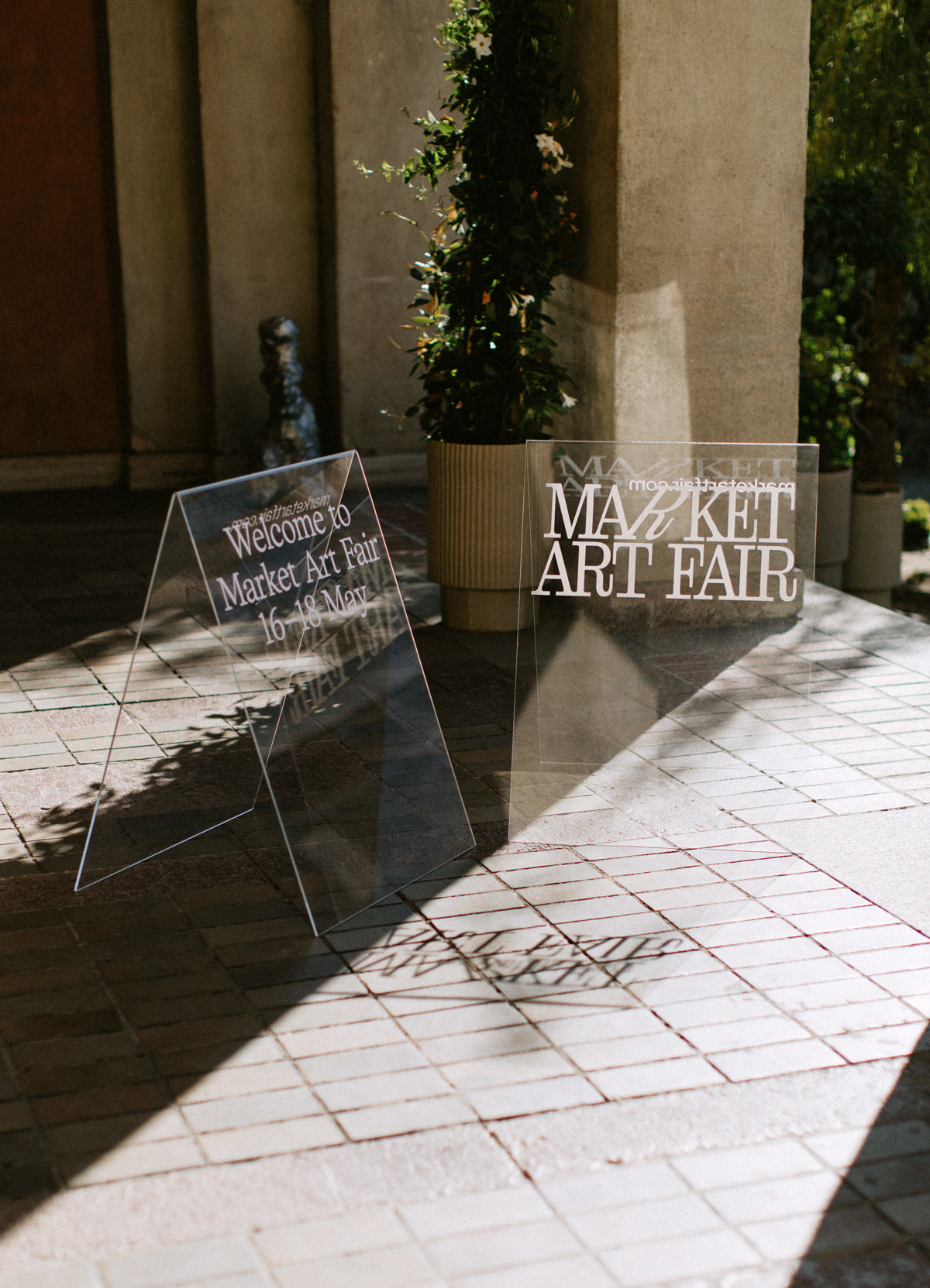
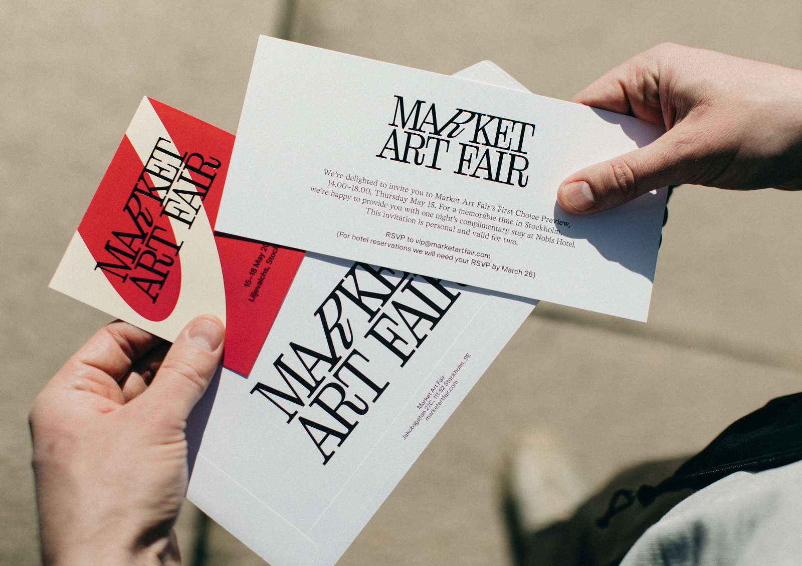
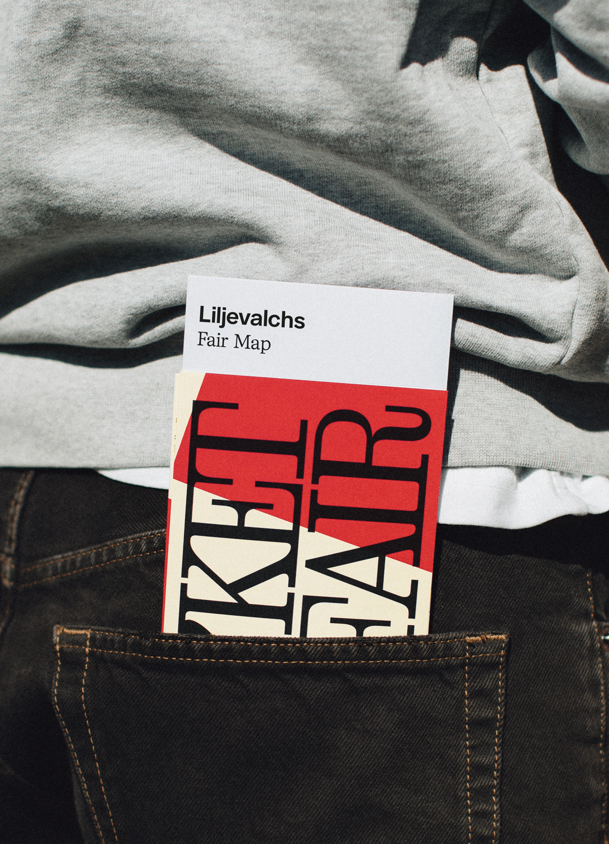
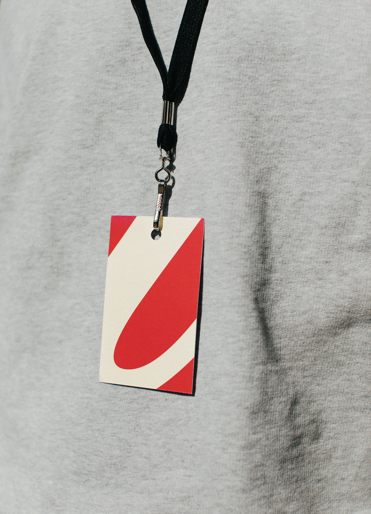
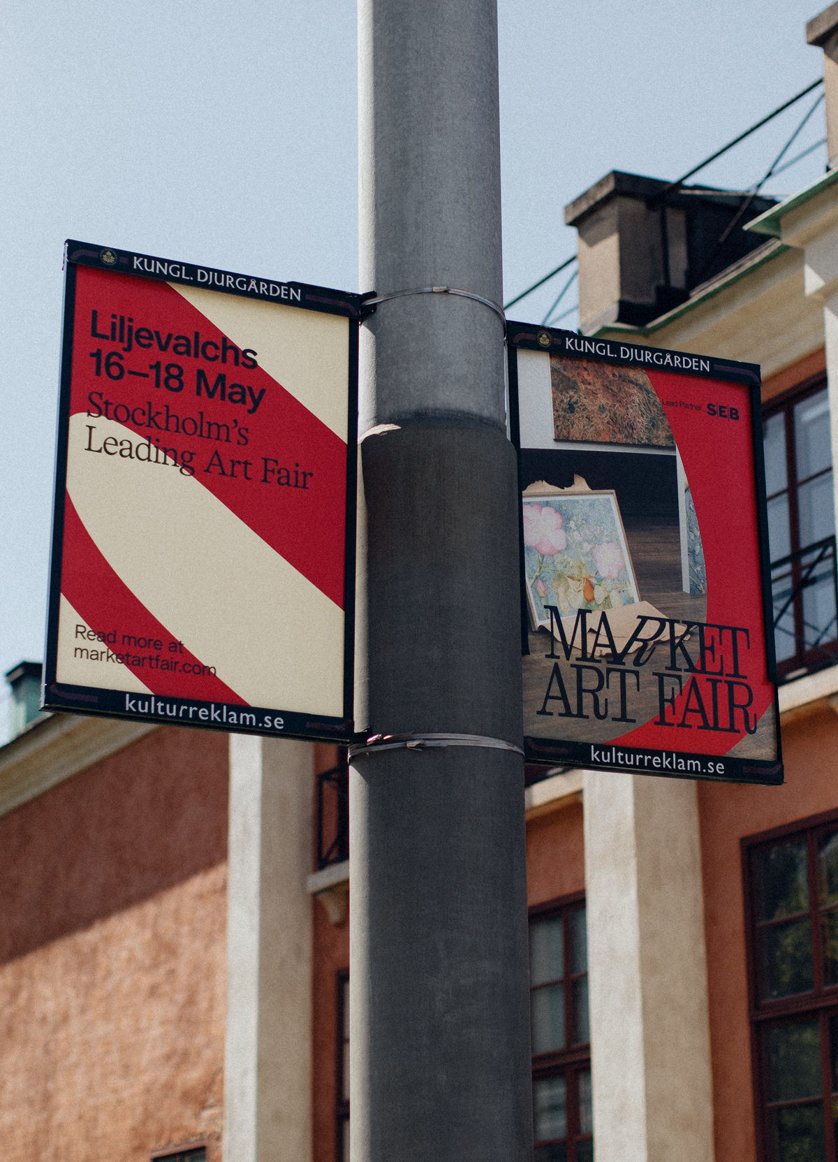
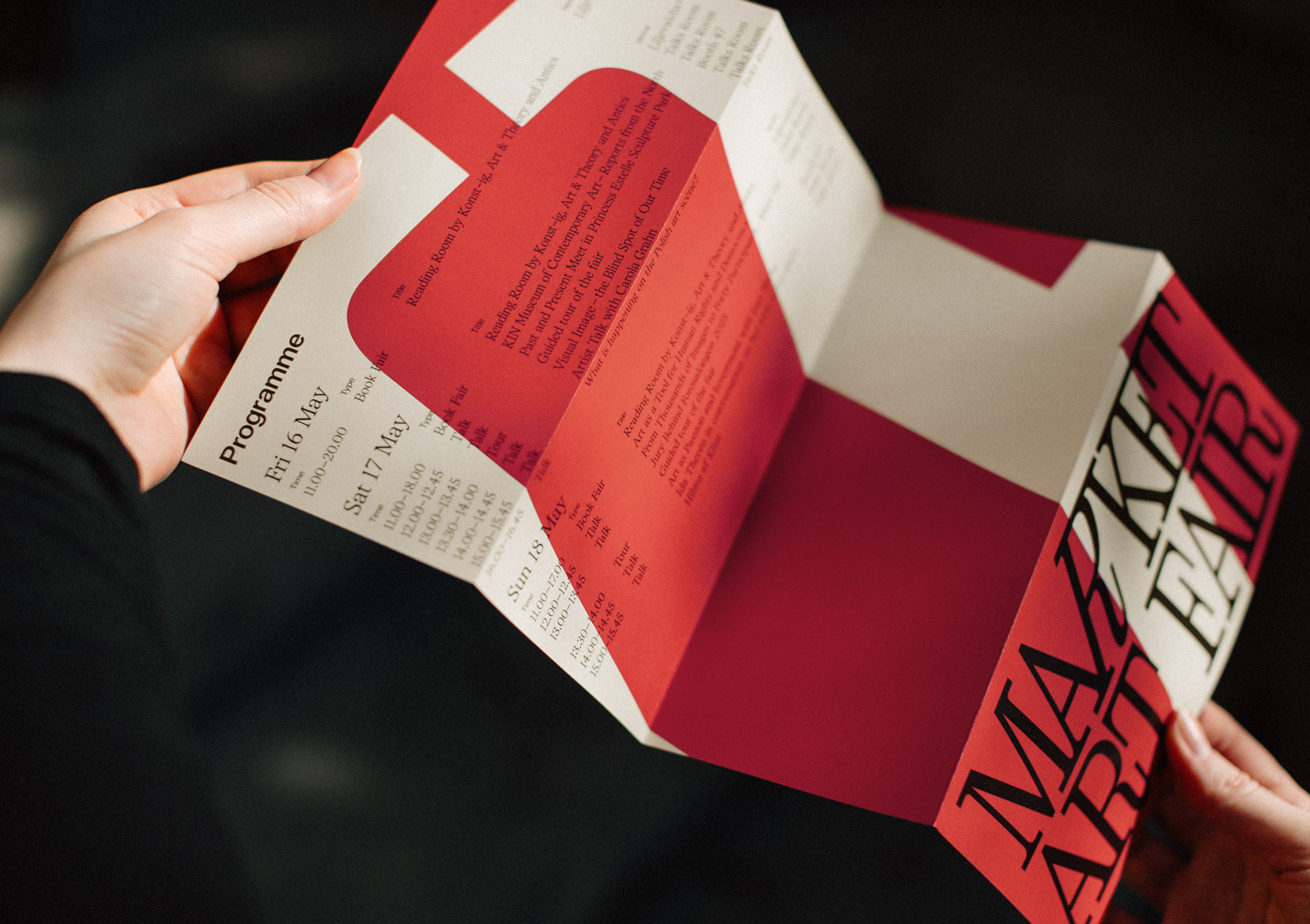
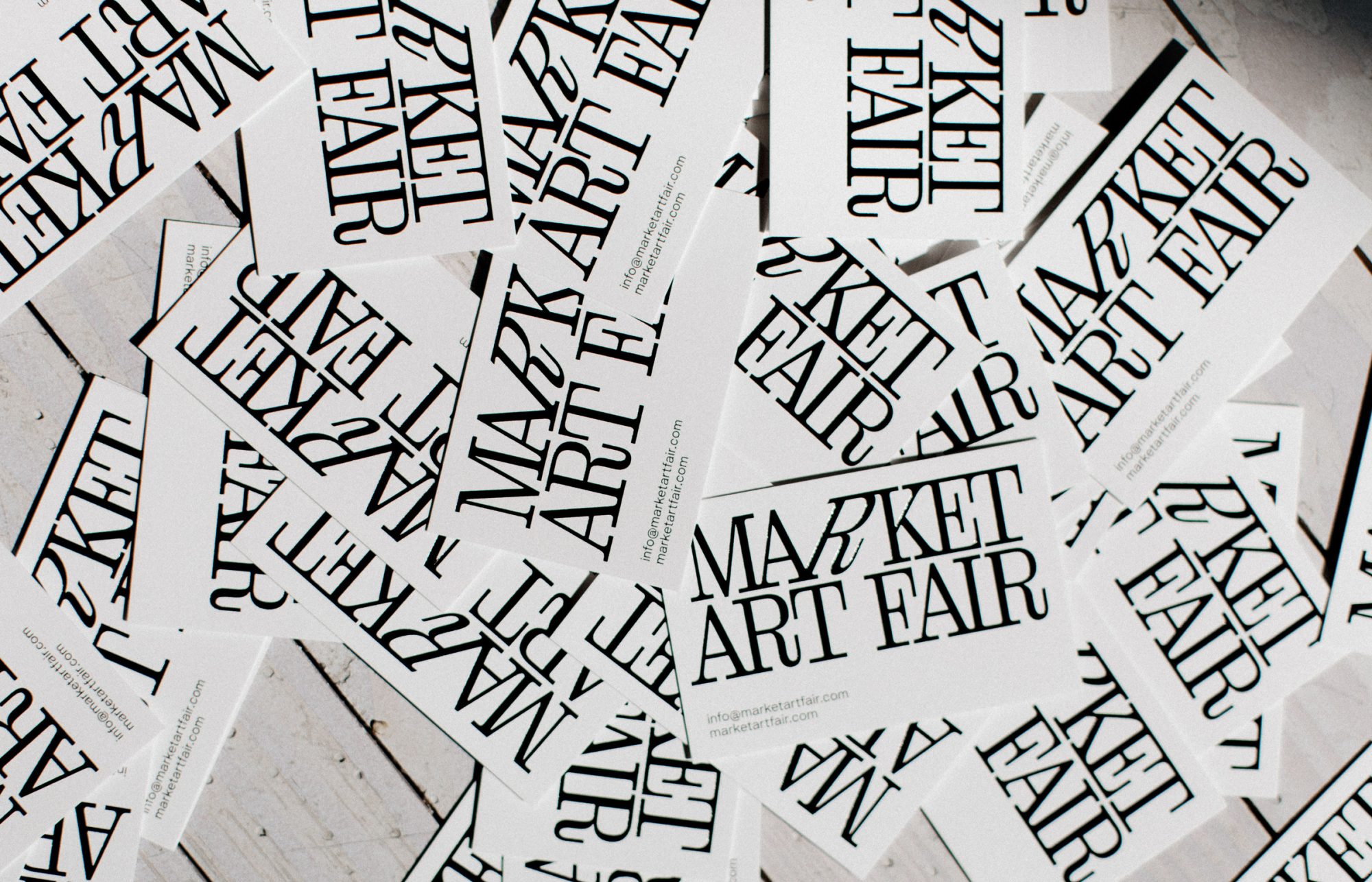
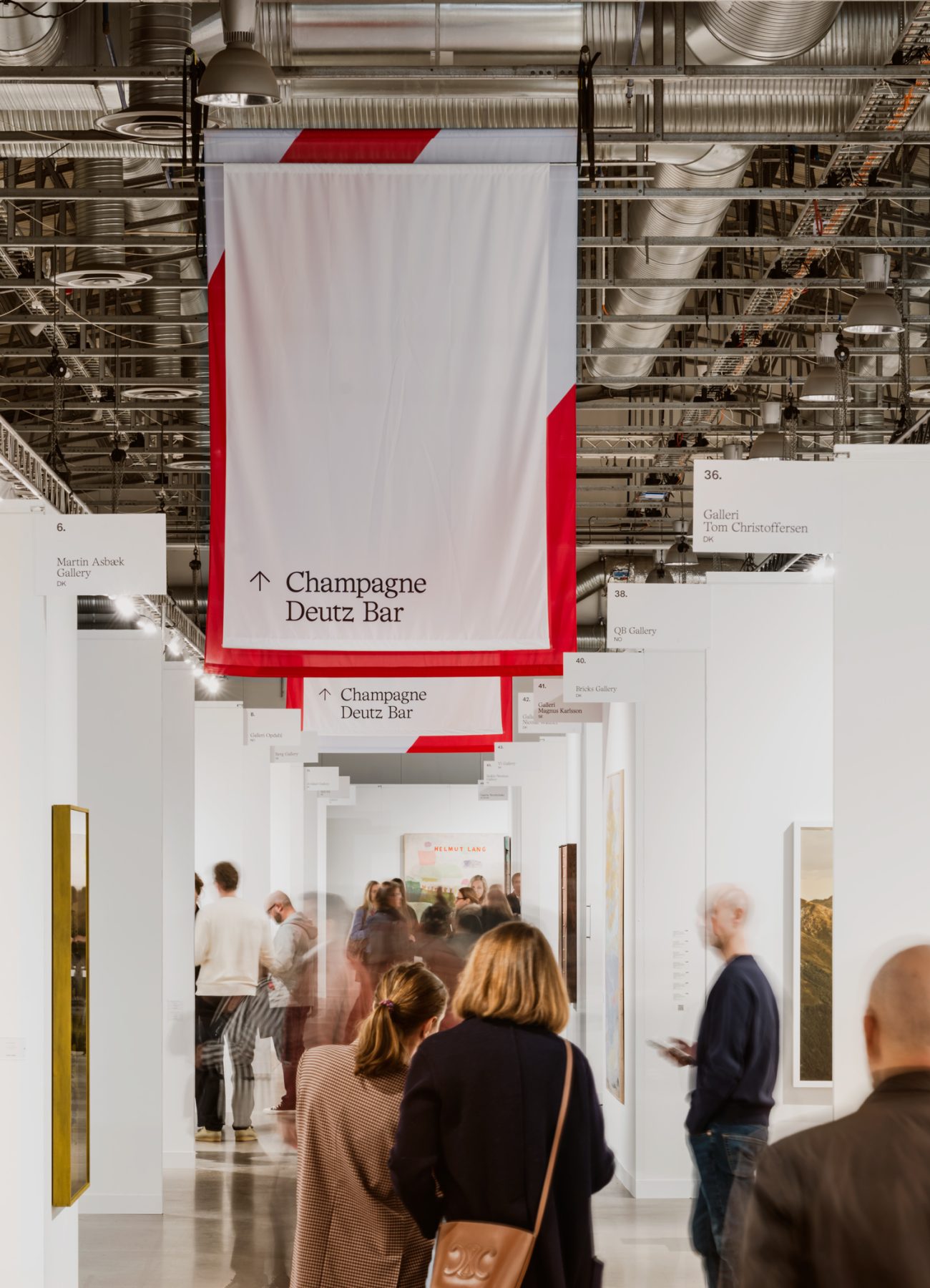
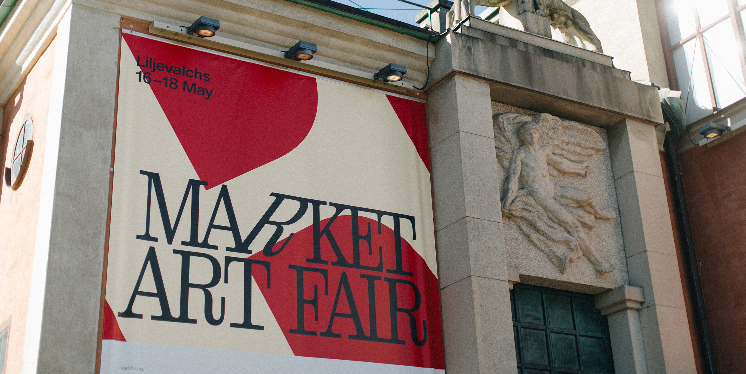
The identity centers around an elegant wordmark in a bespoke serif typeface. A tilted, centered “R” introduces a touch of artistic imperfection — symbolizing creativity at the heart of the fair. A monochrome palette of black and white is refreshed annually with curated accent colors, keeping the identity dynamic and contemporary.
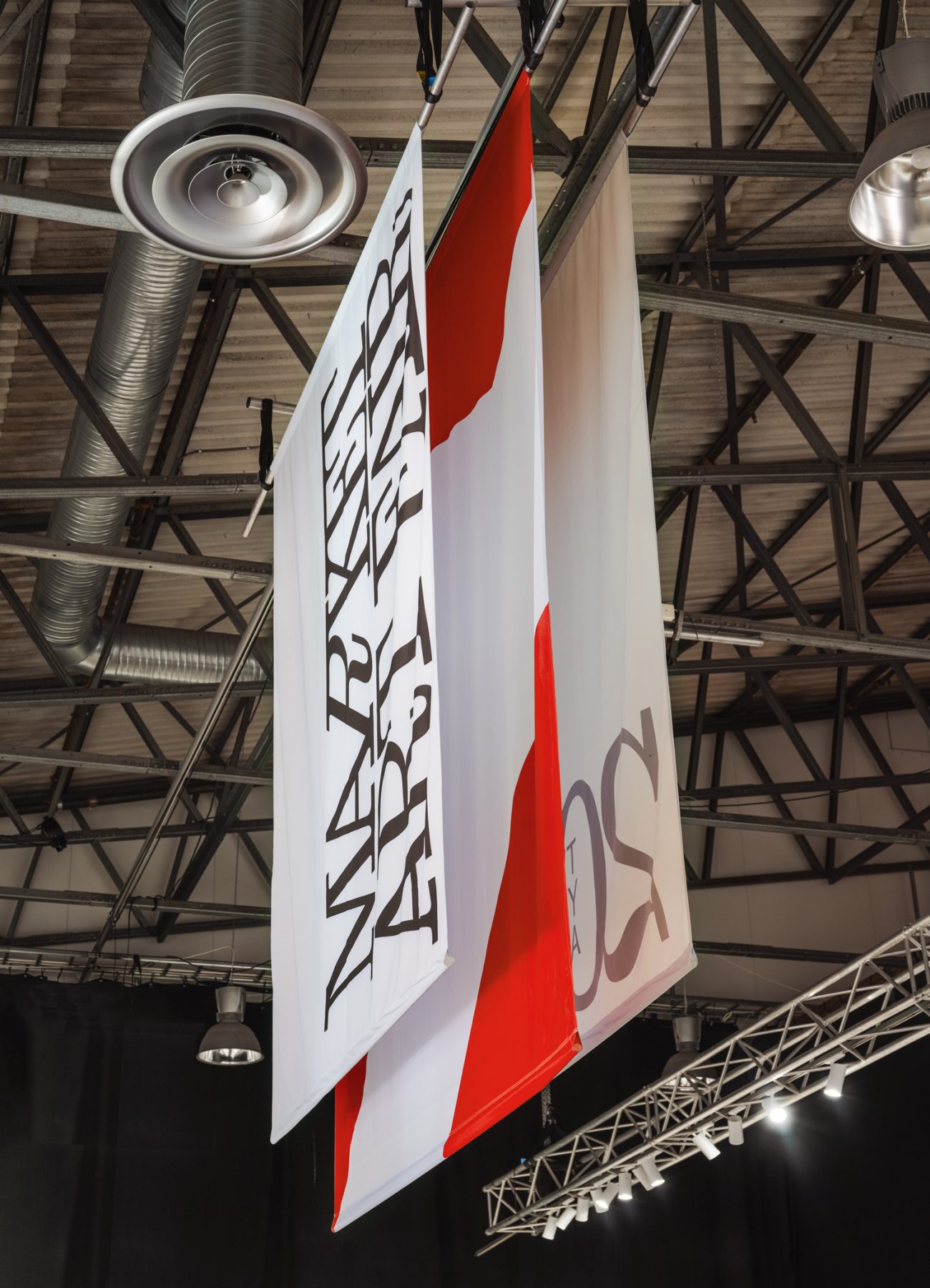
A graphic pattern was developed from close-up sections of the logo, symbolizing the endless perspectives viewers can have when experiencing different works of art. The broad typographic palette combines accessibility with a sense of exclusivity, allowing the visual language to adapt across different platforms and expressions.